COVID-19 Mandate & Protocol MAPS

ECONOMIC ANALYSIS
This report serves to help understand the economic trends occurring in the states that are currently open, or are in the process of opening up. All data is pulled from external sources, which are given credit throughout.
WEEKLY ECONOMIC INDEX (WEI)
The Weekly Economic Index (WEI) is a measure taken from the Federal Reserve Bank of New York. Essentially, this takes data from past quarters, most recently Q3 2020, and compares it to similar data from this quarter on a weekly basis to give an estimation for where GDP currently stands. It is not a precise measurement, but it is known to be fairly accurate. This is an overall measure, and therefore, covers the U.S. as a whole. This can be deemed as a good starting point for looking at the current economic standing.
- Currently, the WEI is sitting around -2.68 percent for the week ending November 7, compared to -3.18 percent for the week prior.

*Data is from the New York Fed
UNEMPLOYMENT CLAIMS
Taken from the United States Department of Labor, the data below shows the initial unemployment claims from each state. When looking at week-over-week change it is evident that about half of the states are seeing at least a small rise in claims. The big outlier one can see is Georgia which had a week-over-week change of over 14,000 less claims than the week prior.

*Data is from the United States Department of Labor
![]()
*Data is from the United States Department of Labor
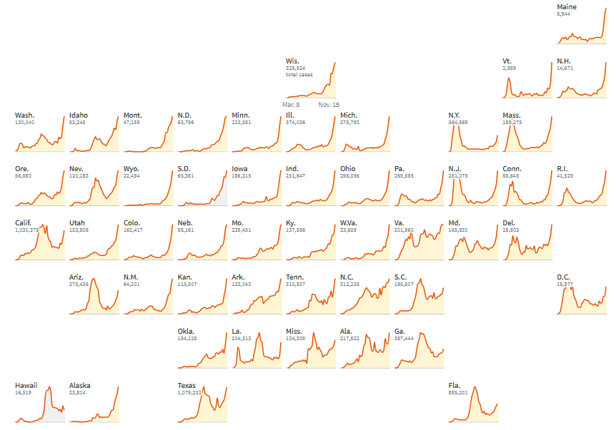
COVID-19 DATA
The following data has been taken from Reuters and represents the current 7-day average of COVID-19 cases currently in the U.S.

*Data is from Reuters Graphics
Listed below are the statistics, as of the week ending November 7, for states that have 5,000+ confirmed cases within the state. These figures will change as the states continue to implement mandates and restrictions, meaning next month’s update will most likely show a different picture than the current data.

*Data is from Reuters Graphics
For a visual reference of all states, the graphic below shows new cases per week for every state in the U.S. The orange line represents new cases, and the blue bar in the graph represents a decline in cases for two consecutive weeks. Furthermore, the graphs are laid out where the state is located geographically in the United States.